


This is part 1 of our series on best practice for charities who want to improve their brand impact.
A third of donors can’t remember the name of the charity they last donated to online (source: Enthuse Donor Pulse). The reasons behind the poor charity name recall for online donors fall into a few different areas.
Firstly, this can be down to the use of third party online giving platforms, which put their brand ahead of charities’.
Secondly, there is a question of the speed people do things online. Just under a third (32%) of people say they do things simply too quickly to remember the name of the charity they donated to. Charities need to think about the layout and structure of donation pages and email receipts to help here. Their logo and branding need to be clear and prominent on both.
Lastly, more than a third of people (34%) are only really interested in the cause, not the charity itself. These are ‘incidental donors’, for instance people who donate to support a friend’s fundraising efforts but the charity itself is not important to them. Currently charities have little control over or impact on them. This is worth consideration, as these are exactly the types of donors that charities need to understand how to engage and convert into more committed supporters.
When setting up a donation page, charities need to consider providing memorable information and imagery about their cause, as well as specifics about their work. This is to ensure that ‘incidental donors’ will slow down and take a moment to consider them.
We have rounded up some best practices to show how you can create powerful branded donation pages.
1. Make sure your logo is loud and proud
A logo is one of your most distinctive brand assets. It’s best to place a brand’s logo at the top left hand side of a website page. It increases brand recall by 89% versus when it is placed on the right hand side or centre (source: Nielsen Norman Group).
Make sure it’s your logo that features in prime real estate, not a fundraising platform. A fundraising platform’s logo should sit in the background. It needs to be present to validate security when payments are taking place but it should be a small signal of trust, not the star of the show. Our own testing shows that getting the position of the fundraising platform wrong can impact progression by up to 27%.
Take a look at these two examples for the same charity.


2. Customise your calls to action
Colour palettes are one of a brand’s most powerful codes. Brand colours can be iconic (think Greenpeace), integral to your cause (British Heart Foundation) and intrinsic to your logo (Red Cross). They help reinforce memory structures, differentiate your charity from others and make recurring donations more likely. Do not underestimate the power of colour in branding, it can evoke an emotional reaction and influence feelings towards a cause.
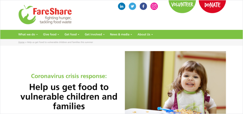
Your calls to action (CTAs) will be more effective if they are vibrant and contrasted against the background of your site, while meeting visual impairment guidelines. A donate button should be the main CTA on the site and take prominence in the visual hierarchy. Check out the example below from FareShare which harnesses the red in its logo and draws the viewer’s eye on the page.
The most important thing to remember is that your CTAs should be consistent with your brand palette. You might want to A/B test a couple of your primary colours to see which performs best with your donors. Either way, make sure it’s your brand colour which stands out, not the fundraising platform’s.
3. Make your Donate button stand out
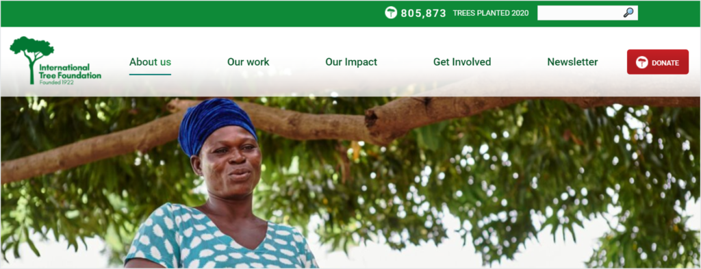
The Donate button on your website is the most important CTA on your site. You need to make it special to delight and engage your donors. The donate button below from the International Tree Foundation perfectly reflects the brand logo and signals how a donation will have impact.
4. Don’t forget the small touches
Every experience with your brand should be memorable so don’t forget the small details.
- Changing a progress bar colour can have an impact on brand recall and overall experience.
- Pictures alongside the donation page can reinforce the story and remind people why they are giving.
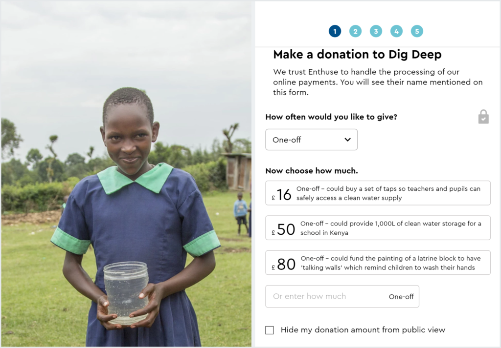
- Make the beneficiary part of the story like Dig Deep does and tell your supporters what impact their donation will make.
5. Check that branded donation pages don’t come at an extra cost
Some platforms claim to offer personalised experience for charities but these often come with extravagant price tags for only the largest charities. We believe in democratising branded fundraising so charities big and small can benefit. Branded solutions are included in our products as standard.
Putting your brand in the centerstage for maximum impact
When setting up the donation page for your charity, putting your brand in the centerstage will help you be more memorable, build a lasting relationship with your supporters and raise more. Make sure your donate button stands out and if you can, make it unique to your cause. Don’t forget about the small touches. Customise your donation page with personalised text and images so donors will slow down and feel they are an important part of your story.
This article is part of the More for Your Cause series on branding. We’ll discuss more on the importance of brand recall and brand distinctiveness for charities in our next blog posts.